A one-page site for Krachang Khaolak, a southern Thai seafood restaurant at Thap Lamu pier in Phang Nga and a MICHELIN Bib Gourmand in 2026 and 2027, in Thai and English
Seafood restaurantWeb design / One page / Thai and English

Client
Krachang Khaolak
Industry
Seafood restaurant
Scope
Web design / One page / Thai and English
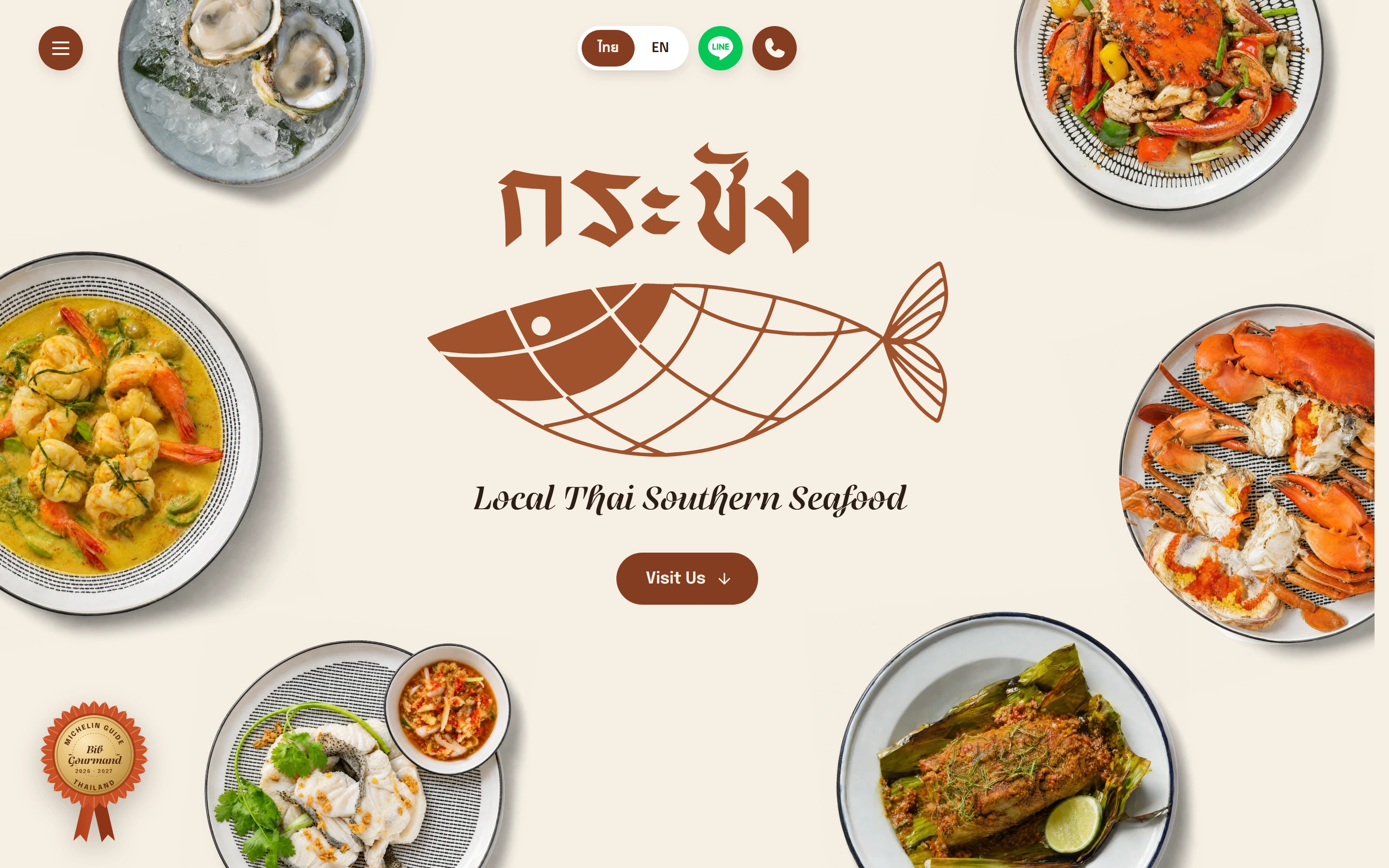
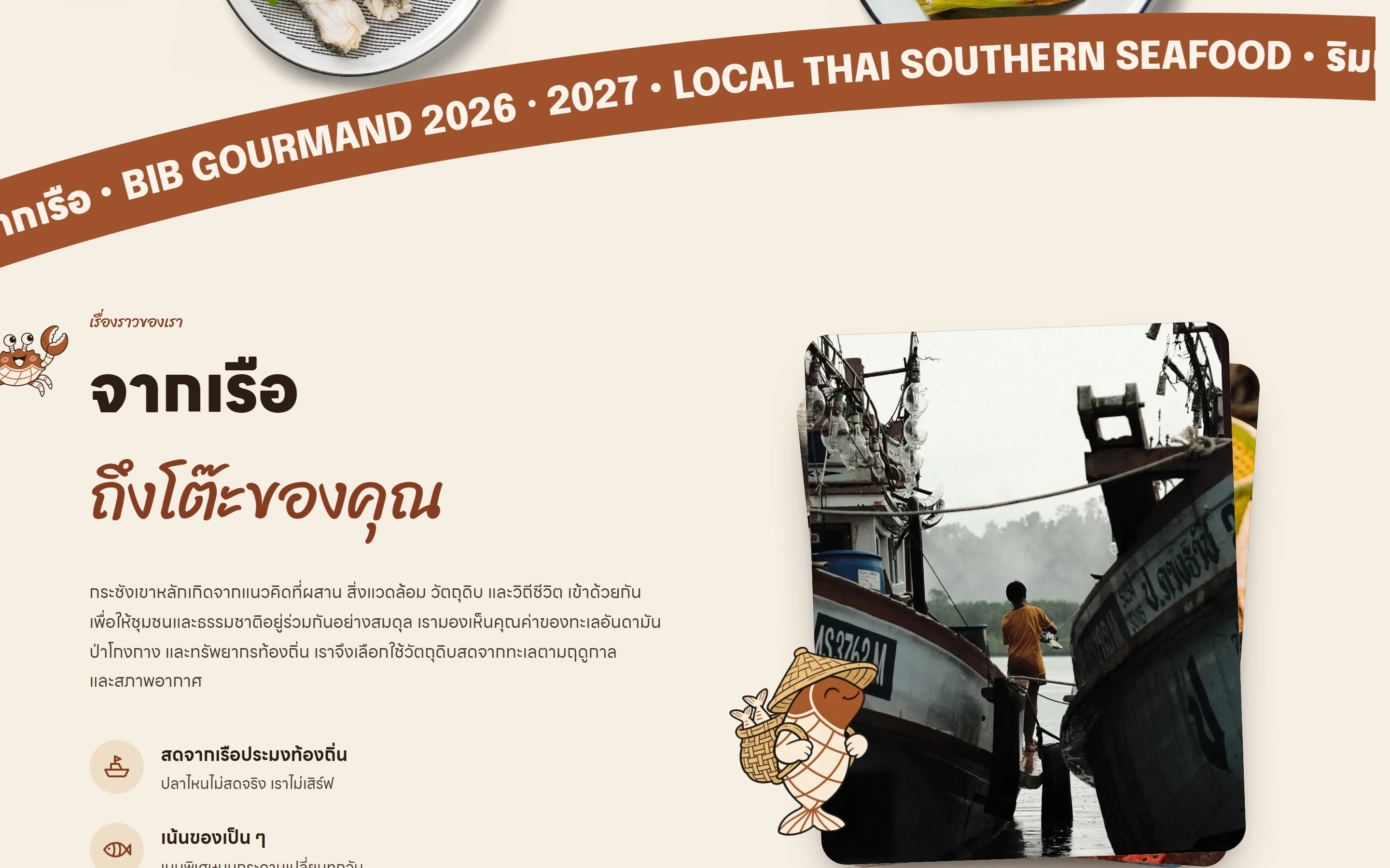
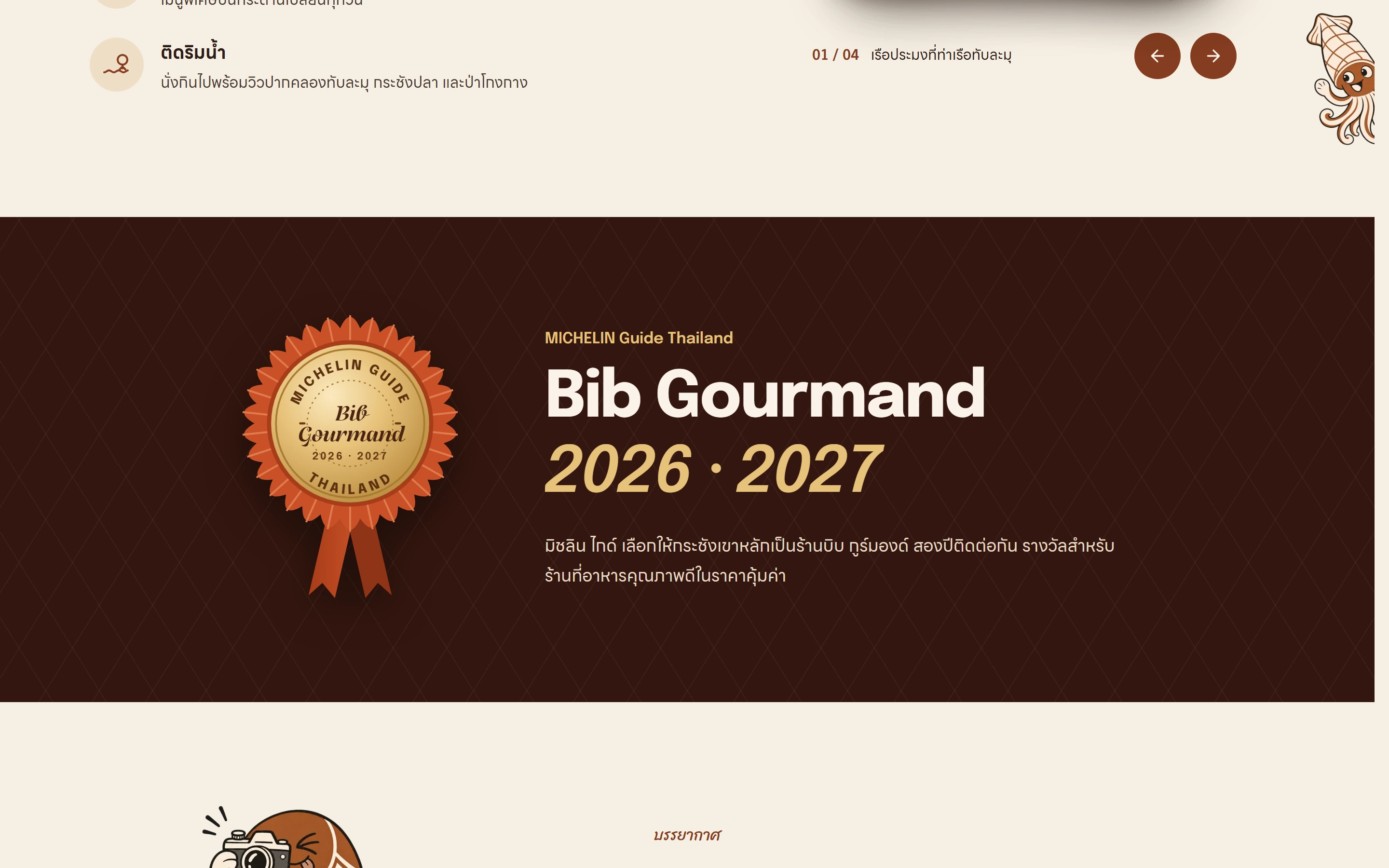
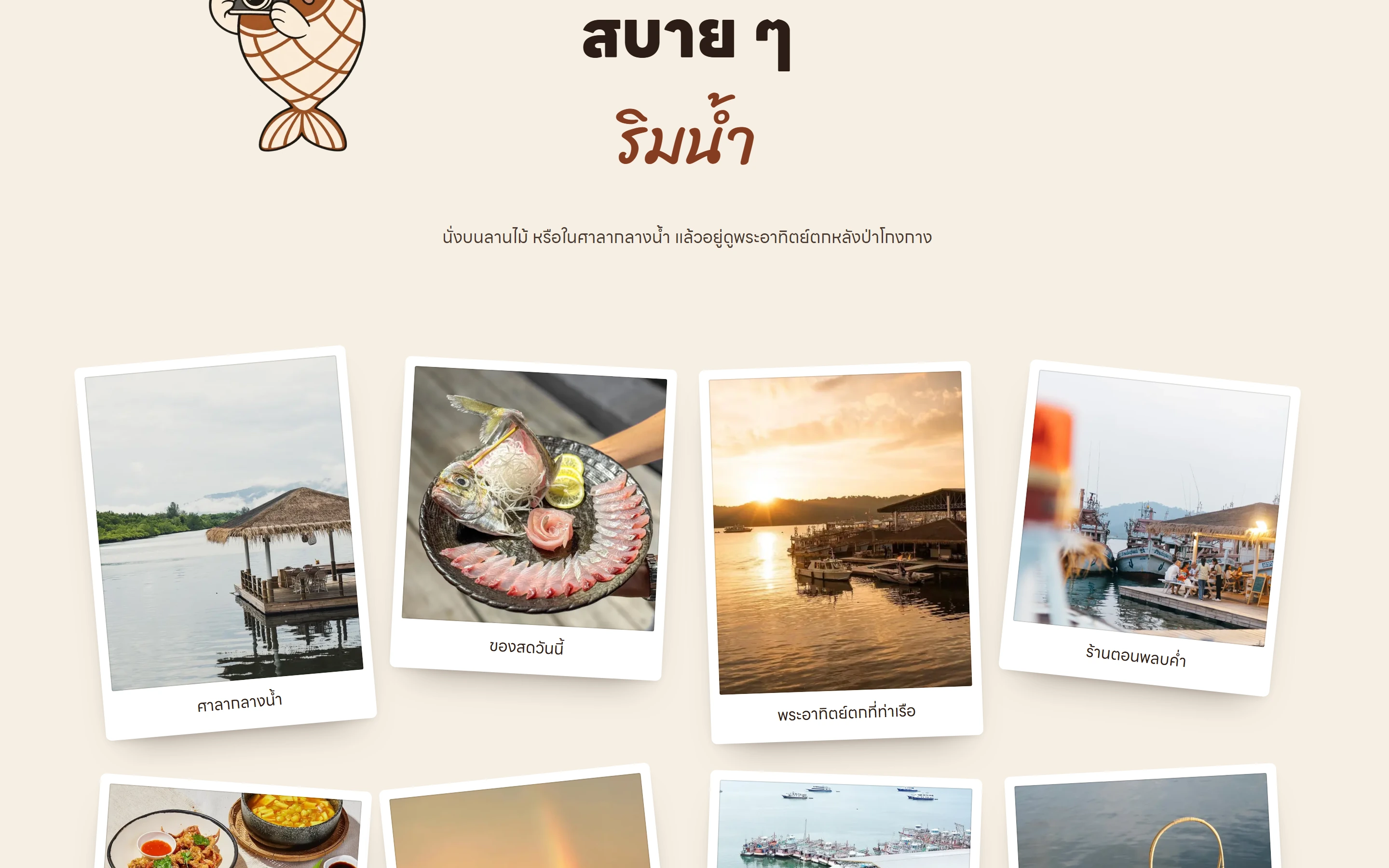
The whole home page
Colour palette
Typefaces
Headings

Body text

Accent

The job in numbers
2
languages on one page, Thai at / and English at /en
5
sections, from the opening to Visit Us
8
photos on the instant-print wall
0
forms: guests book on LINE or by phone
01
A seafood restaurant at Thap Lamu pier
Krachang Khaolak is a southern Thai seafood restaurant at the mouth of the Thap Lamu canal in Thai Mueang, Phang Nga. Tables look out over the fish cages and the mangroves, most of the catch comes from local boats, and the specials change every day. The MICHELIN Guide Thailand named it a Bib Gourmand in 2026 and again in 2027.
The restaurant had no website yet, only Instagram, Facebook, LINE and its Google listing. The owners laid out the page themselves: an opening with a Visit Us button, their story, the atmosphere, how to find them, and a footer.
02
Brown from the restaurant, a fish from the logo
The main colour is the brown of the restaurant’s Instagram profile picture, on a cream ground, with orange and gold kept for the award medal. English headings are set in Epilogue, Thai in LINE Seed Sans TH, and the accent lines in Telma. When the site opens, the fish in the logo draws itself, blinks and flicks its tail, then two sheets of colour lift away on a wave.
The opening is a table seen from above, with seafood plates set around the logo. Below it, a curved ribbon of text follows the scroll, a crab, a squid, a prawn and a clam peek in from the screen edges, and the logo fish turns up as a mascot in each section.
03
Five sections on one page
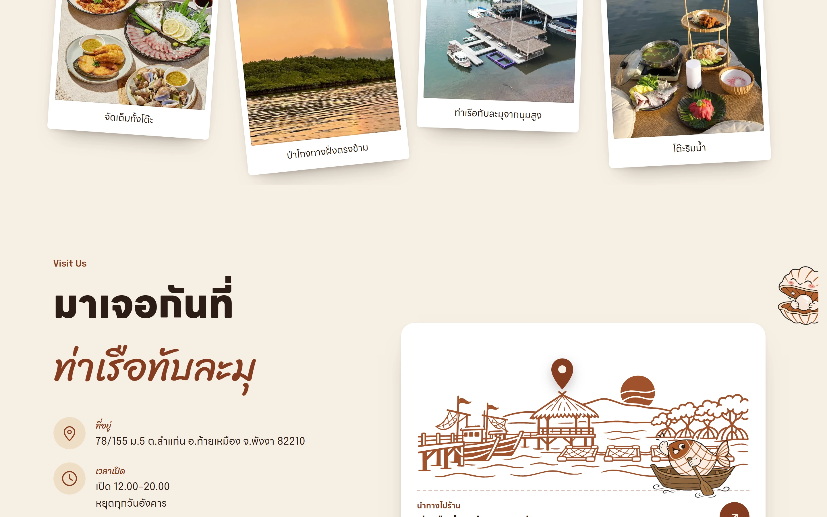
The story section tells how the catch goes from the boat to the table, beside a stack of four photos you can swipe or step through. Then comes a deep brown band with the Bib Gourmand medal for 2026 and 2027, and a wall of eight instant prints that develop as they land.
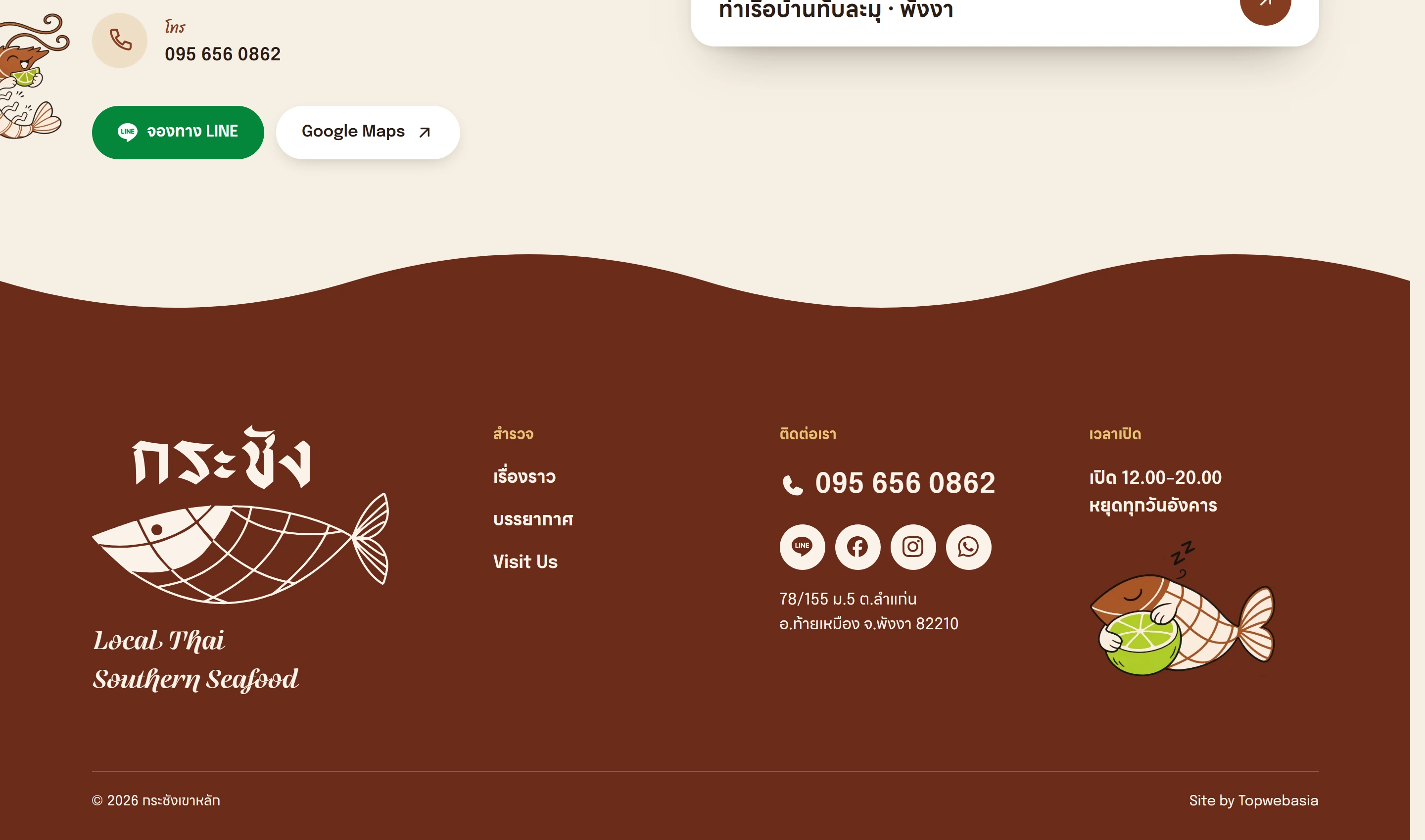
Visit Us has the address, opening hours, phone number, a LINE booking button and a Google Maps button, next to a drawing of the pier with a pin on the restaurant.
04
Booking on LINE, no forms
The site has no forms and collects no personal data. Guests book a table through the restaurant’s LINE, by phone or on WhatsApp. On a phone, the LINE button opens a chat with a booking message already typed; on a computer it opens the restaurant’s add-friend page.
The map is a link to Google Maps rather than an embedded map, so the page loads no Google cookies.
05
Two languages, one page
Thai is the home page and English sits at /en, with the two linked by hreflang. Thai words that browsers tend to split in the wrong place are kept on one line.
If your restaurant needs a site like this, see restaurant website design or one-page websites.

Want a site like this for your business?
Tell us about your business on LINE or WhatsApp. We reply within one working day with the right package and the closest project to yours.