A skincare brand, from brand direction through to the product pages
Aug 2026Skincare brandBrand direction / Web design / Product pages
Client
Frost
Industry
Skincare brand
Scope
Brand direction / Web design / Product pages
Date
Aug 2026
The pages
01
The brief for a skincare brand
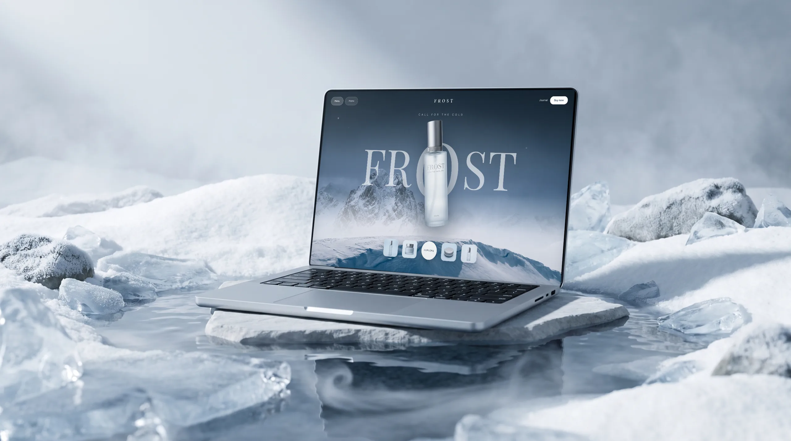
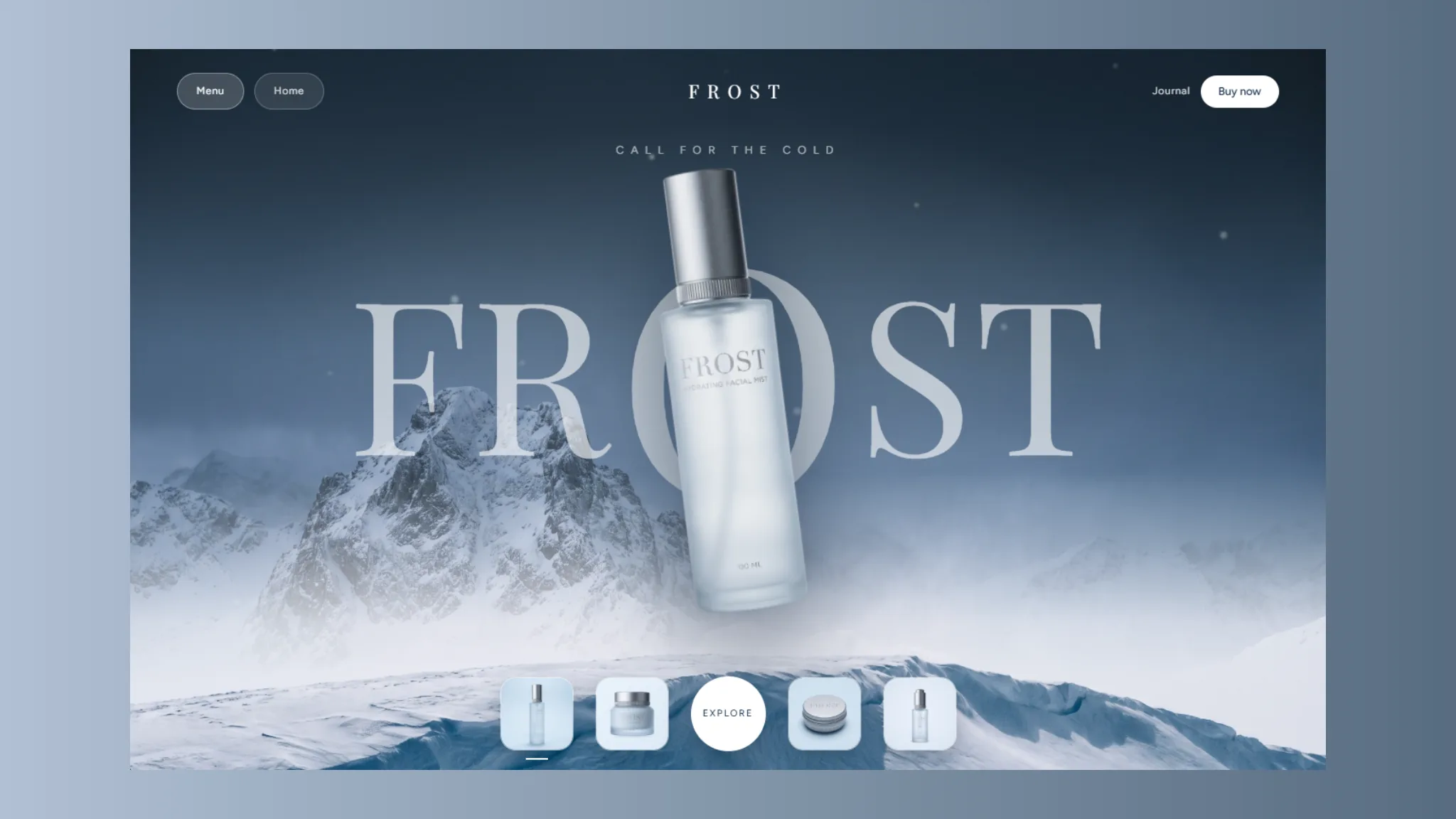
Frost is a skincare brand. This job was the brand and the product pages, not an online store. What it needed was a site that explains how the brand thinks about skin and what each item does, before anyone decides to buy through any channel.
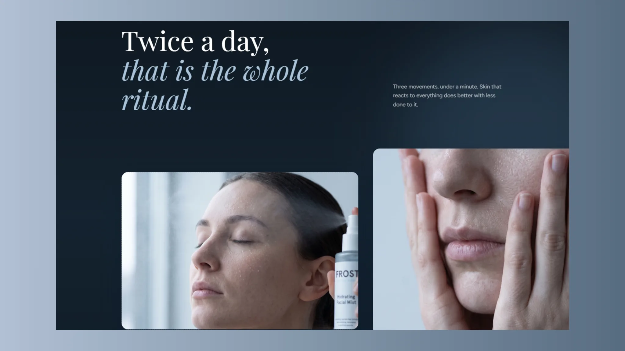
We started with brand direction, the palette, the type and the photographic tone, then wrote the page structure so the product pages, the how-to-use pages and the journal all say the same thing in the same voice.
02
Colour and type
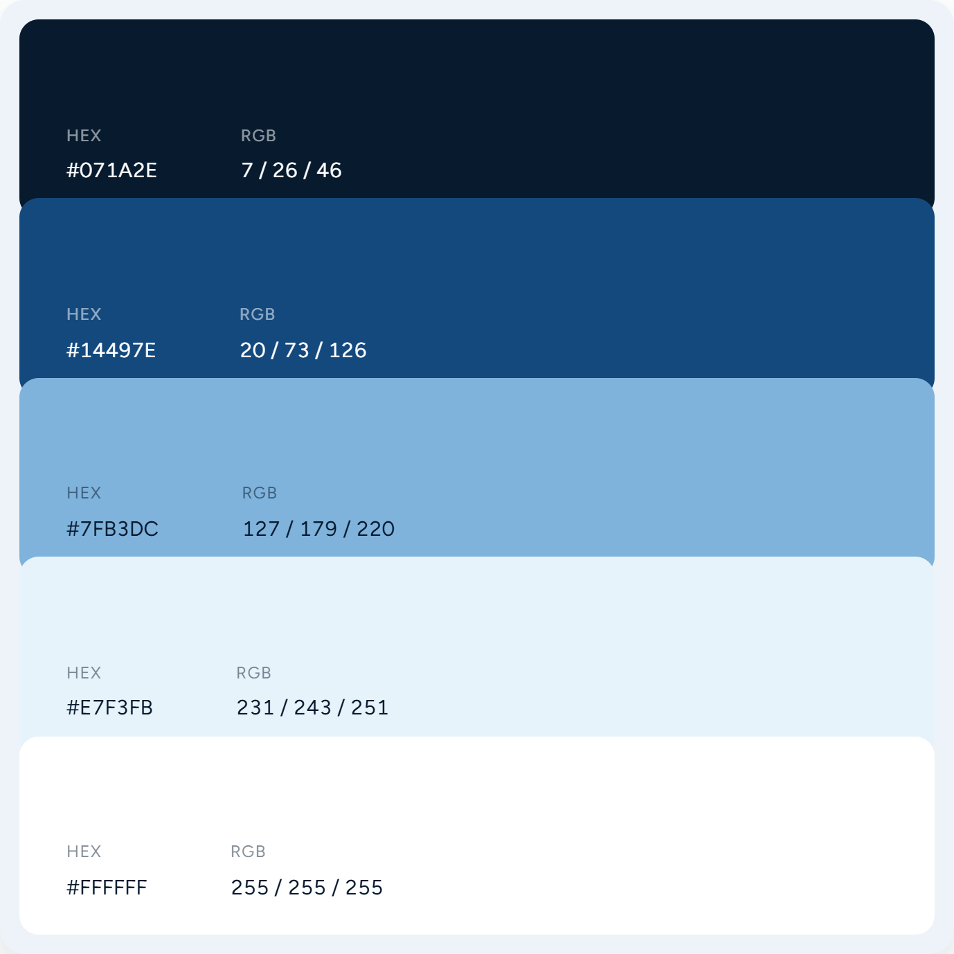
The palette runs five shades, from a near-black navy through blue and pale blue to ice and white. The set was chosen so product and skin photography look clean on any of them.
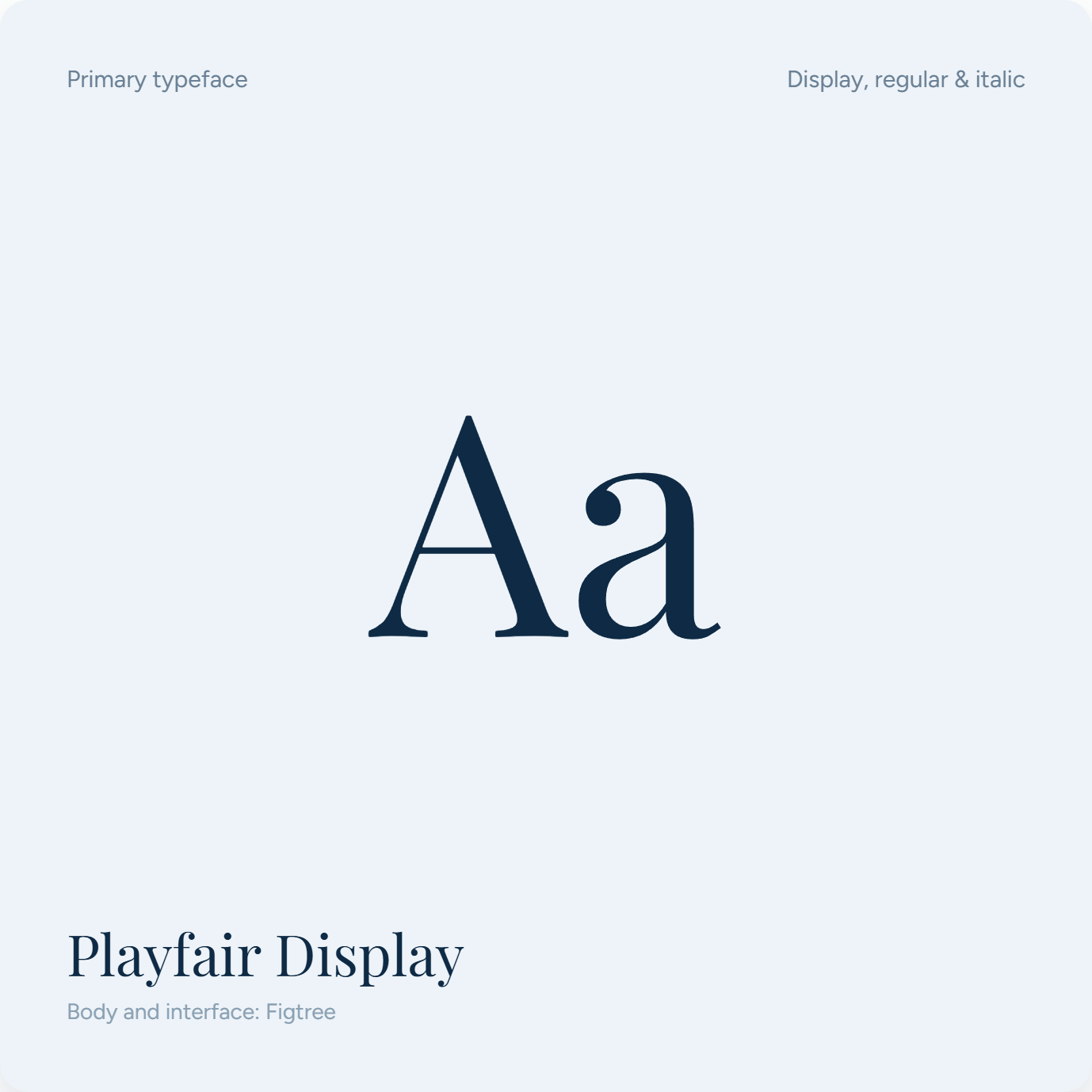
Playfair Display sets the headings in both roman and italic, with the italic reserved for the lines that carry the brand voice. Figtree sets the body and the interface, which reads at length on a phone.
03
Product and journal pages
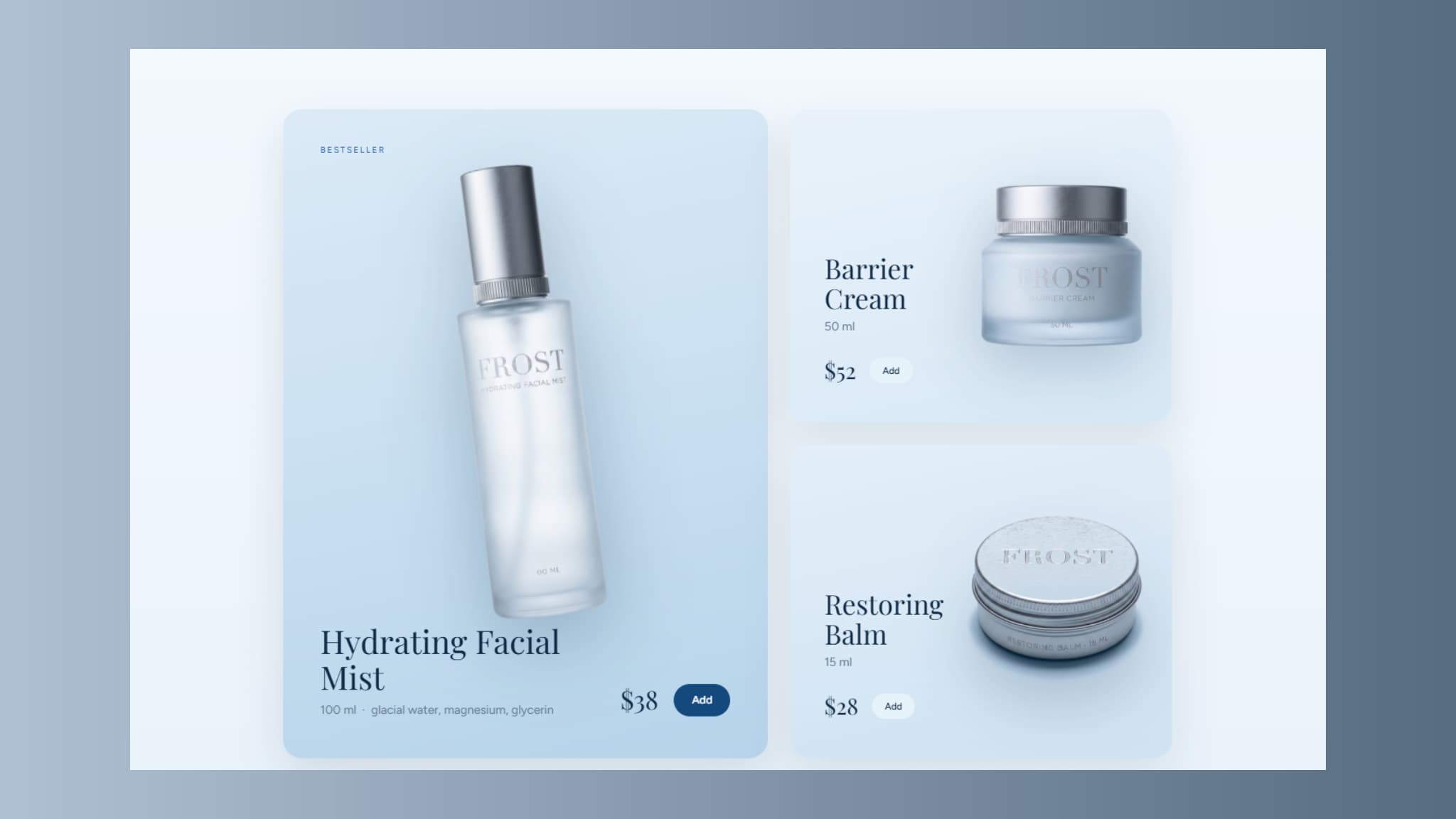
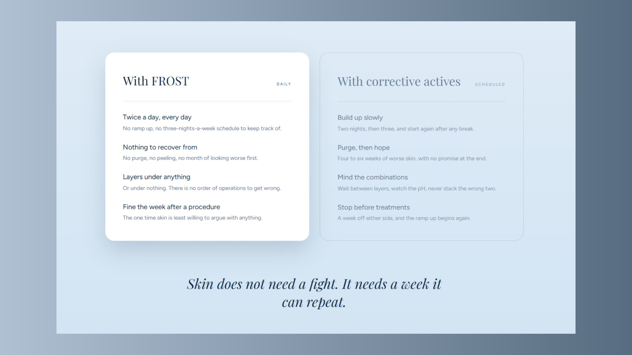
The product pages give each item a card with the photograph, the size, the key ingredients and the price. A comparison section sets daily care beside a scheduled routine so a reader can see which one they are.
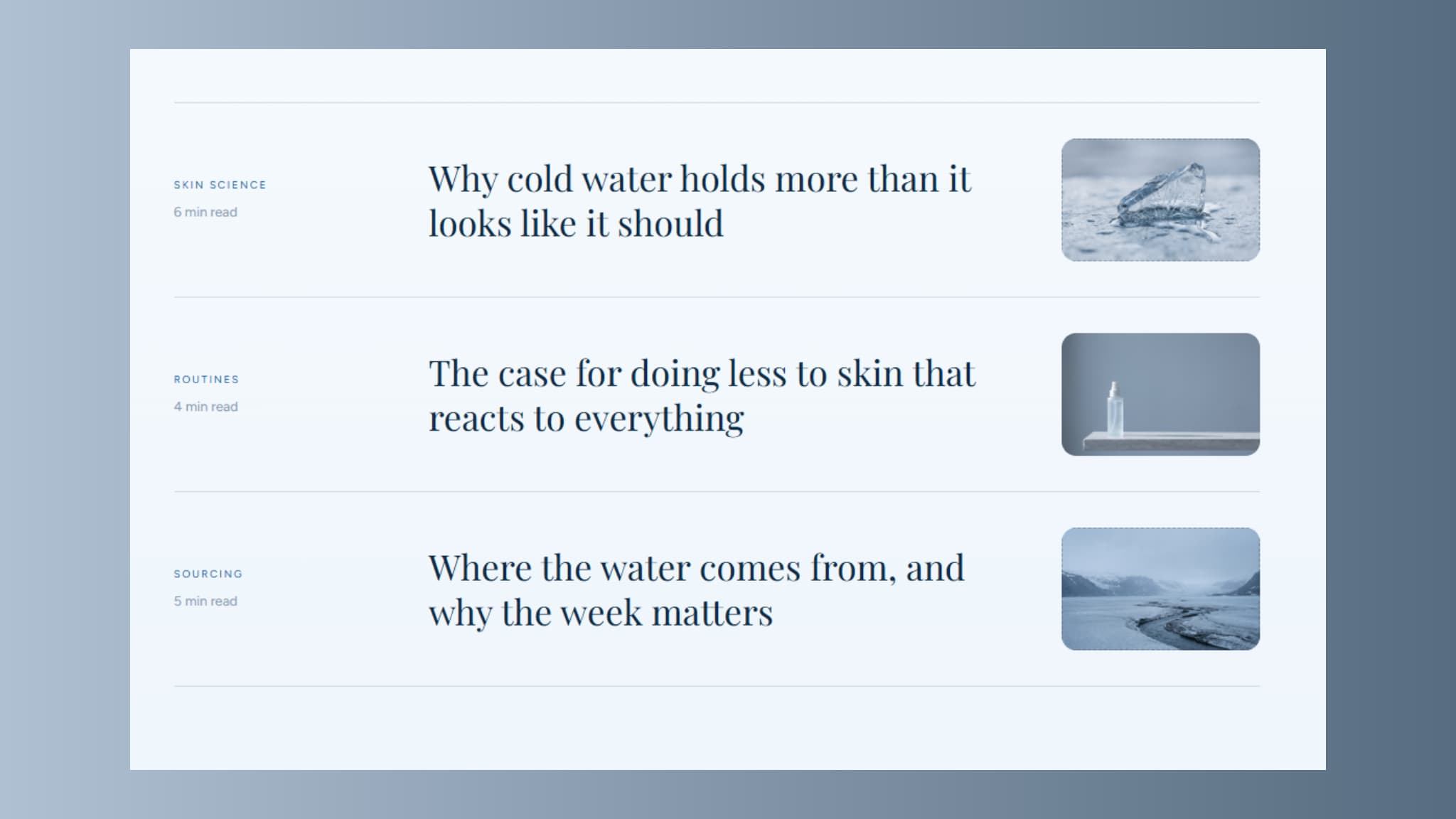
The journal is a plain list with the category, the reading time and the headline, so the brand can keep adding to it. The site has a Thai and an English version, with schema and sitemap in place and Analytics and Search Console connected before launch.

Want a site like this for your business?
Tell us about your business on LINE or by email, or book a 30-minute call. We reply within one working day with the right package and the closest project to yours.