A property brand on the Andaman coast: a home page you can search from straight away, and listing pages with the price, the title and the viewing button in one view
Real estateWeb design / Front-end development / Listing UI
Client
Compass
Industry
Real estate
Scope
Web design / Front-end development / Listing UI
The pages
The job in numbers
3
property types: villas, condos and land
4
facts on every listing photo: beds, baths, area and year built
7
colours: black, greys, creams and gold
2
buttons on a listing: see more and book a viewing
01
Property on the Andaman coast
Compass sells villas, condominiums and land in Krabi, from Ao Nang along the Andaman coast. Anyone on the site is weighing a large sum, some for a place they have not yet seen and some from abroad, so it has to look credible from the first screen.
The brief was a home page that says at once what the brand sells and where, lets people start searching on the first screen, and a listing page that leads to a booked viewing.
02
Searching starts on the first screen
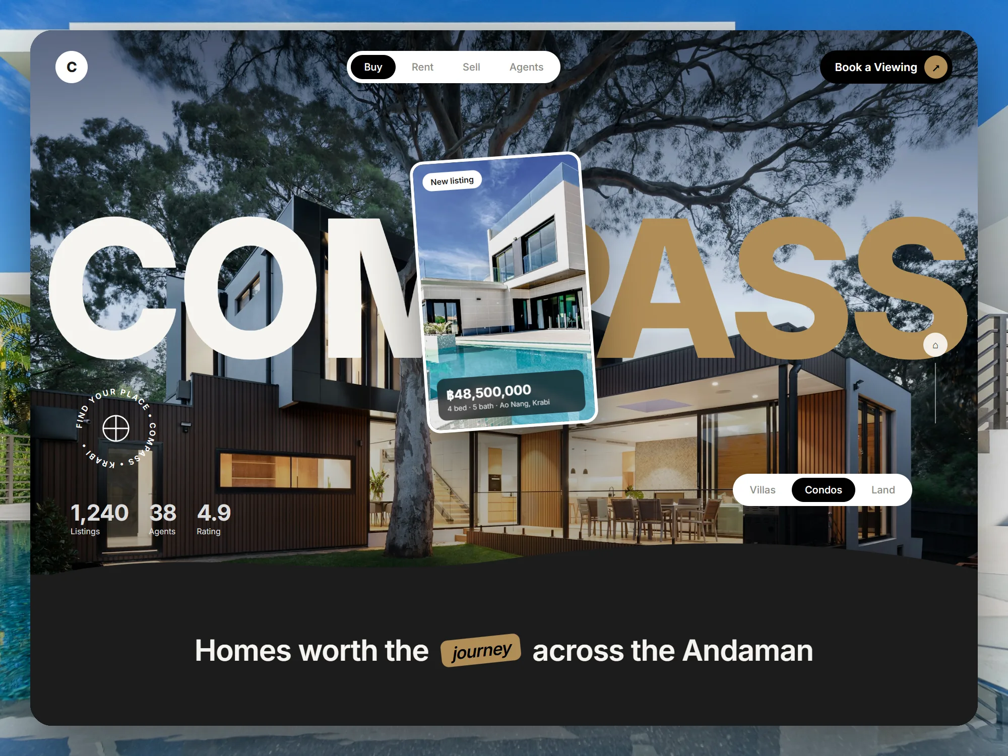
The main menu is one pill, Buy, Rent, Sell and Agents, in the middle of the header, with a black Book a Viewing button on the right. Under the picture, Villas, Condos and Land tabs pick the property type straight away.
A new-listing card floats over the home page with its price, bedrooms, bathrooms and area, so a visitor sees a real property before reading a word. The brand’s headline figures sit in the lower left, under a round compass badge.
03
Black, cream and gold, so the houses lead
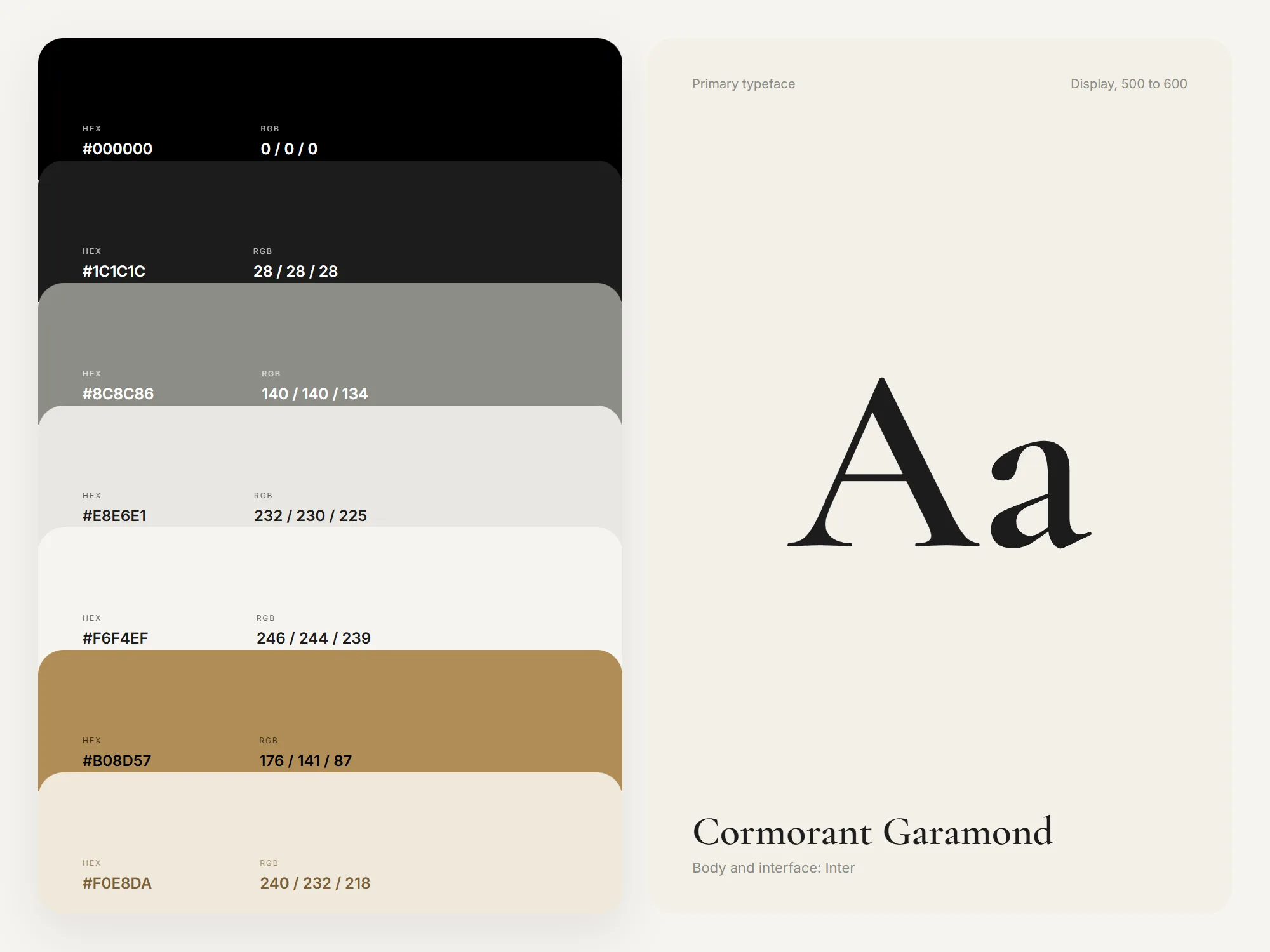
The palette runs seven colours: black, two dark greys, stone, cream, gold and a warm cream. All of them are quiet, which leaves the property photos as the most colourful thing on the page. The giant COMPASS on the home page is split white and gold and sits behind the listing card.
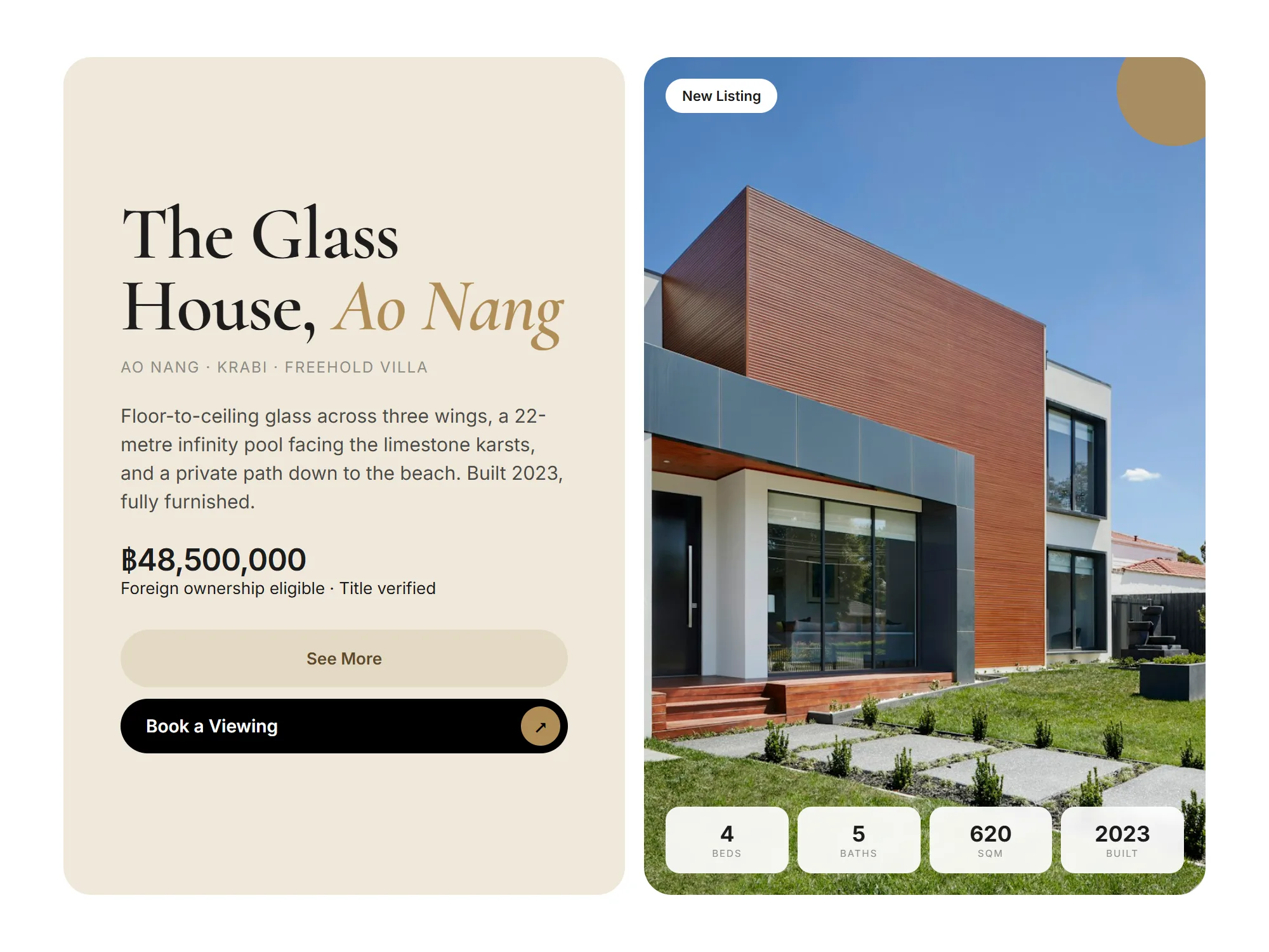
Headings use Cormorant Garamond at 500 to 600, with a gold italic for place names, as in The Glass House, Ao Nang. Text and figures use Inter, which keeps prices and floor areas clear on pages that are full of numbers.
04
A listing page with the button in sight
The listing page sets the name, location, title type, description, price and the Foreign ownership eligible and Title verified notes beside the photo, with See More and Book a Viewing in the same view, so nobody scrolls back up to find the button.
On the photo sit a New Listing tag and four tiles: bedrooms, bathrooms, floor area in square metres and the year built, so someone comparing several homes sees the main figures at a glance.
05
Every page leads to a viewing
Book a Viewing sits in the header and on every listing. A home at this price is sold when someone walks through the door, so the site’s job is to get people to a viewing quickly.
The owner adds new properties and edits the content through their own back end. If you sell or let property and want a site like this, see real estate website design.
06
A page per property, in two languages
Each property has its own page, and its name, location, price and size are real text rather than words inside a picture, so Google can read what the property is and where it stands.
The site has a Thai and an English version and works at every screen size, with schema and sitemap in place and Analytics and Search Console connected. If your listings are online but Google barely shows them, see SEO services.

Want a site like this for your business?
Tell us about your business on LINE or WhatsApp. We reply within one working day with the right package and the closest project to yours.