A matcha bar in Ekkamai, with a site that answers the first four questions in one place: where it is, when it opens, what it serves and what it costs
Matcha barBrand direction / Web design / Menu pages
Client
Hoshi
Industry
Matcha bar
Scope
Brand direction / Web design / Menu pages
The pages
The job in numbers
4
questions answered before a visit: where, when, what and how much
3
menus: matcha, cake and boba
6
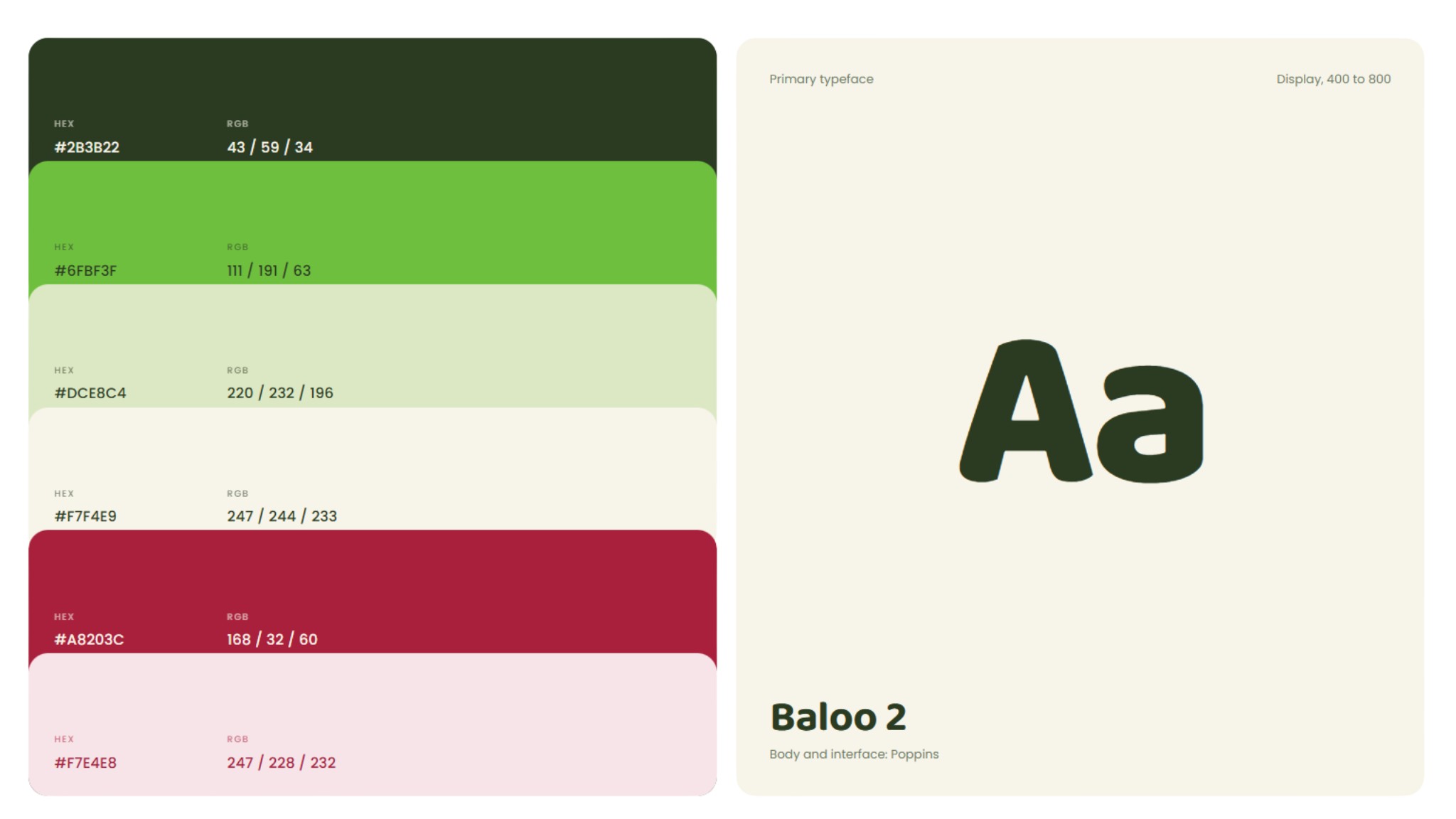
colours in the brand palette
2
buttons on every menu card: see more and get a drink
01
A matcha bar in Ekkamai
Hoshi is a matcha bar on Sukhumvit 63 in Ekkamai, open from 7:30 to 18:00. It sells matcha by the cup, iced, strawberry and hazelnut among them, alongside cake and boba.
The job began with brand direction, the palette and the type before any page, because drinks, cake and boba all had to live in one system. Then we ordered the pages the way customers actually ask.
02
Four questions before anyone walks in
Before choosing a café, most people want four things: where it is, when it opens, what it serves and what it costs. If the answers are buried in old social posts, plenty of them pick another place.
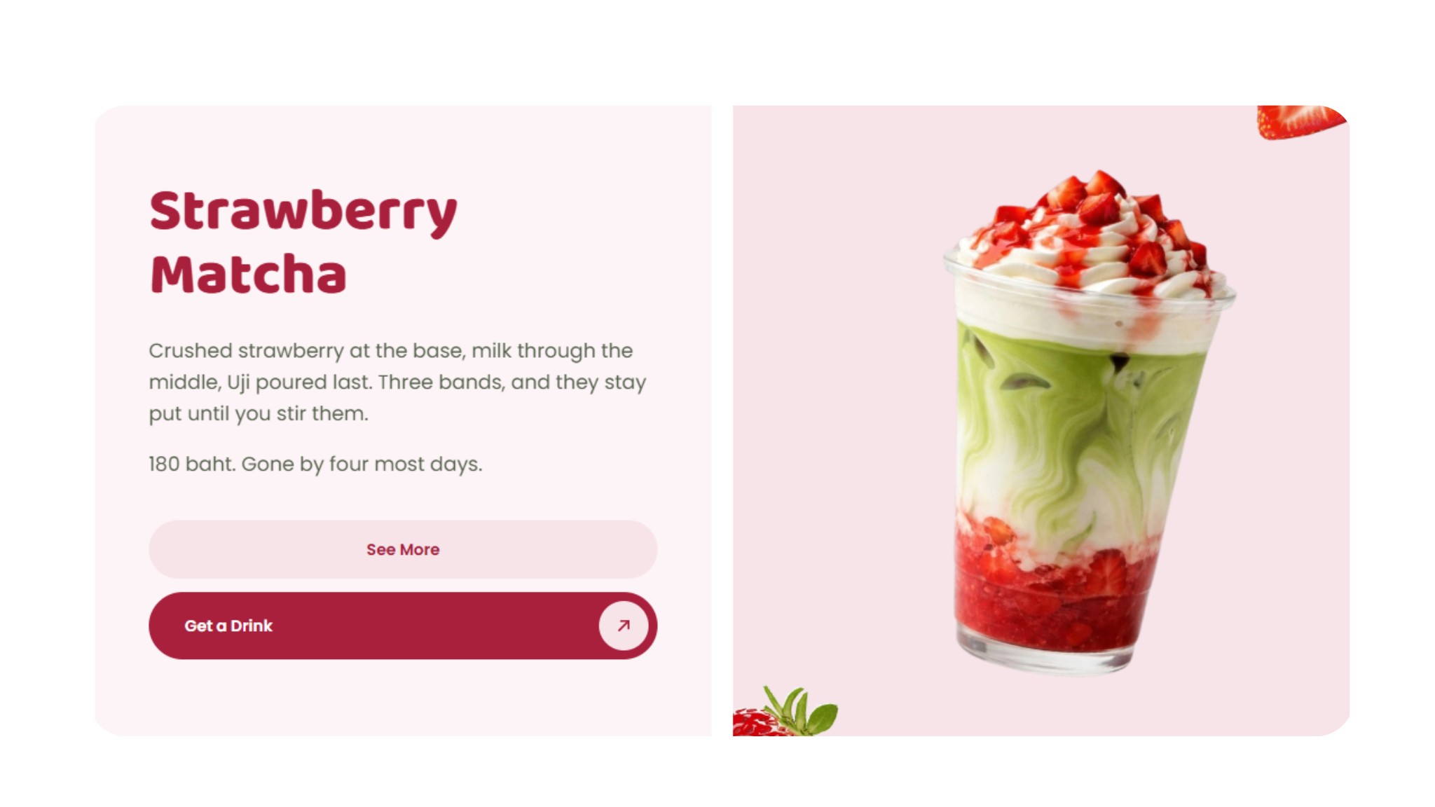
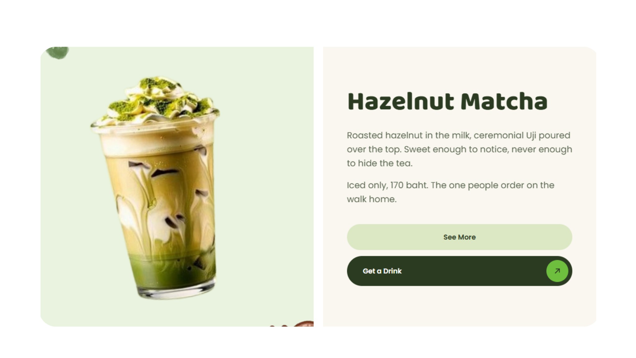
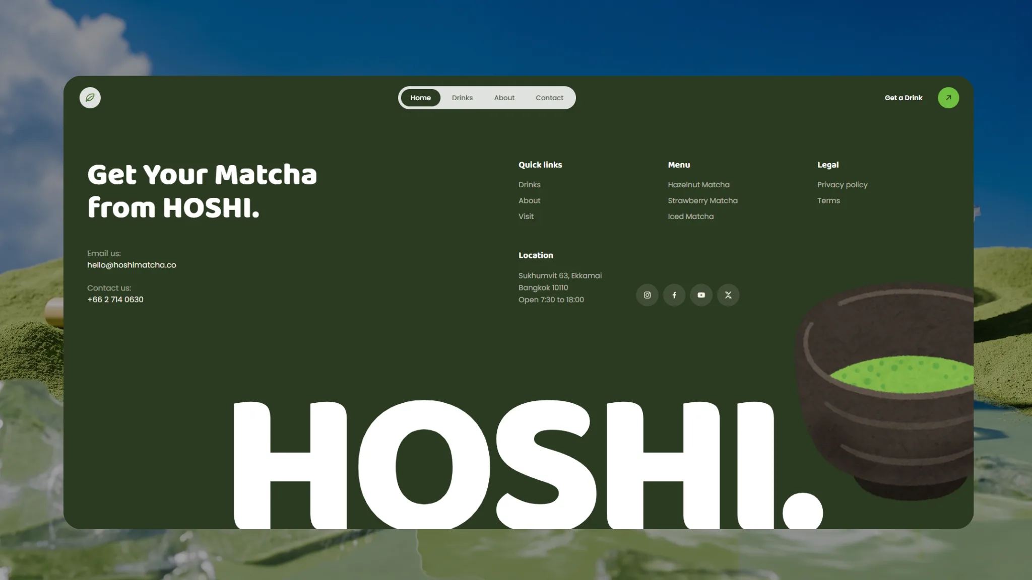
So the site answers all four fast: the price is on every menu card, the address and hours sit in the footer of every page, and the Get a Drink button stays in the top corner of every screen.
03
Matcha green, strawberry red
The six colours come from the drinks themselves: deep green, bright green, pale green and cream, cut with strawberry red and a pale pink. Headings are set in Baloo 2, round and heavy, in weights from 400 to 800, with Poppins for text and buttons.
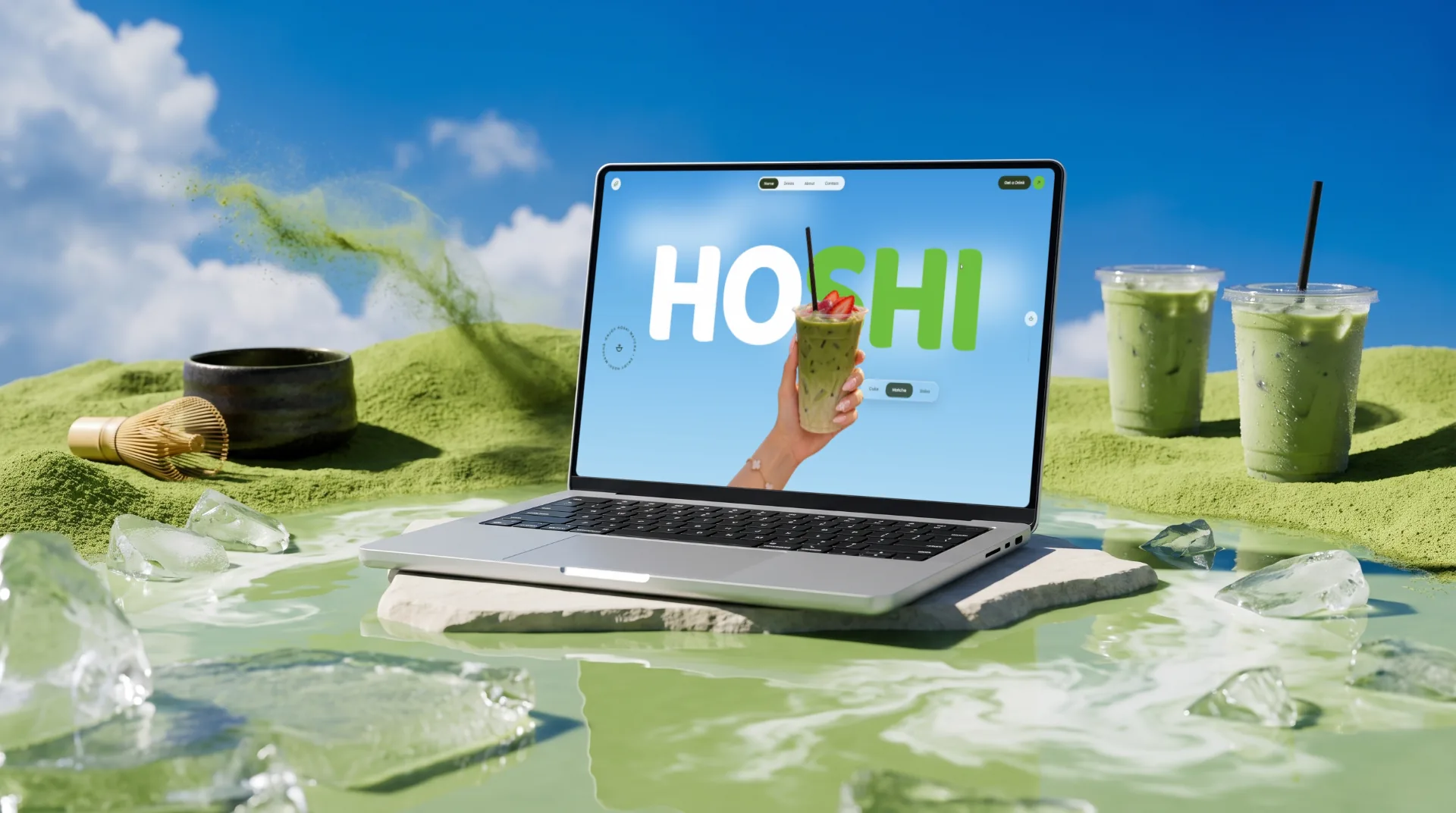
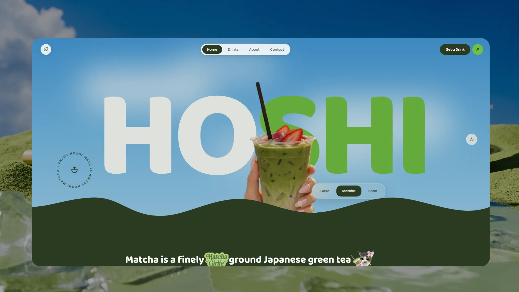
The home page opens on HOSHI in letters as wide as the screen, with a hand holding a strawberry matcha in front of them so the picture has depth. Beside it sit a round Enjoy Hoshi Matcha badge and Cake, Matcha and Boba tabs, before a deep green wave leads down into a strip of running text with stickers.
05
A footer that works like a shop sign
The footer of every page collects what people ask most: the address on Sukhumvit 63, the opening hours, email, phone, links to all three drinks, the privacy policy and terms, and four social channels, closing on a giant "HOSHI." beside a bowl of matcha.
Someone standing outside the shop with the site open on a phone scrolls to the bottom and finds all of it without zooming in or opening another page. The owner edits the menu, prices and hours through their own back end.
06
A menu search engines can read
The drink names, descriptions and prices are real text on the page, not a photo of a menu, so Google and AI tools can read what the shop sells and for how much. The address and hours are written the same way on every page.
The whole site has a Thai and an English version, with schema and sitemap in place and Analytics and Search Console connected before launch. To show the shop on Google Maps with the same details, see Google Business Profile setup.

Want a site like this for your business?
Tell us about your business on LINE or WhatsApp. We reply within one working day with the right package and the closest project to yours.